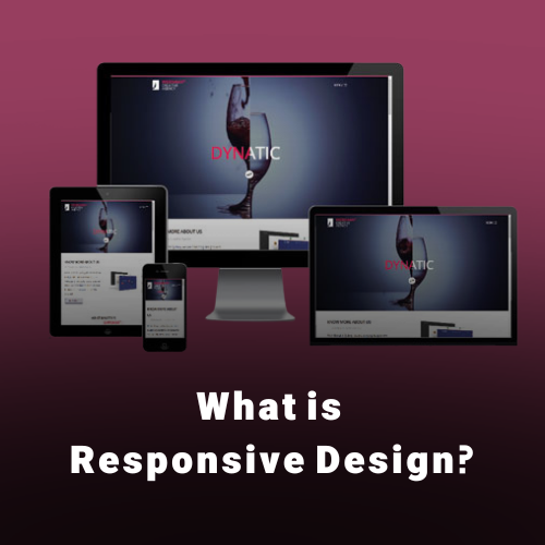
What is Responsive Design?
Responsive web design is an approach to web design by which, the websites are created in a way to be rendered appropriately on any device from small to large screen size. Using this approach makes the website scaled, based on the device screen size, so the appearance on the user’s device looks good.
We, through this article, will be discussing responsive design, its difference with adaptive design and also see if responsive design has any effect on SEO. Check “SEO Services” to find out more about how you can boost your website’s ranking in Dubai.
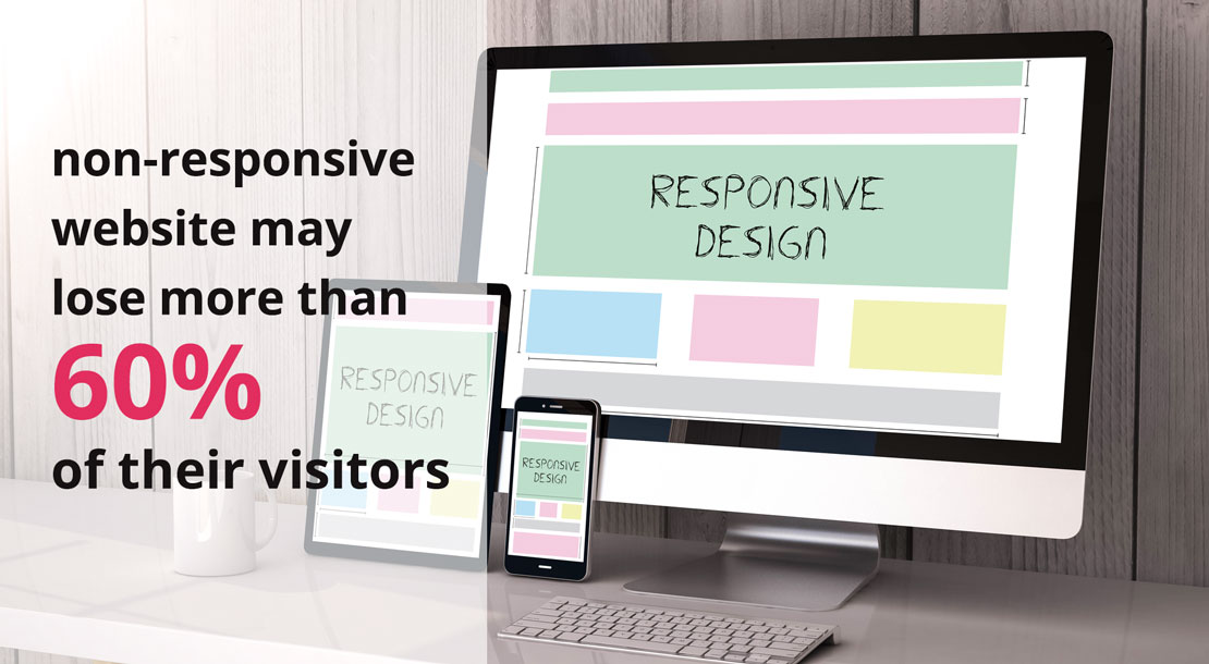
If we go back in time to more than 15 years ago, when smartphones and tablets were not being used like today, responsive design was almost unknown. By increasing the number of people using smartphones and tablets, designing the websites in a responsive way became crucial. It is worth to consider that based on multiple surveys, a non-responsive website may lose more than 60% of their visitors due to such weakness.
Once the need for viewing a website on mobile phone increased, web design companies tried to build a mobile version website in parallel with the desktop version for their visitors. Going forward, they developed a special software by which visitors could have access to the website content. However, neither mobile version nor special software could become popular as people and users preferred to see the original website on their mobile phones.
That’s where the responsive web design stepped in. On responsive websites, when a user visits the website with a desktop or laptop, all the contents and details can be seen. Once the screen becomes smaller, unnecessary parts of the website will become hidden, but important contents will be displayed on the small screen with a suitable appearance.
How Responsive Design prepares us for future changes
Responsive design would not only scale your website for any device in the market, but also it prepares your website to be adjustable to any new technology or screen size, as no one knows which screen size will be introduced to the market in the future. With the possibility of developing new standards for display dimensions, market participants should be ready to cope quickly and smoothly.
As an alternative to responsive design, creating an independent software has an important disadvantage, that is the need for continuous updates to be synched to the newer versions of the operating systems. However, by applying responsive design on your website, its appearance modifies itself automatically. In other words, a responsive designed website adjusts itself to fit into any screen size, regardless of the operating systems.
Responsive Design advantages for SEO
Responsive design method would help the search engines to search out your website contents easier, which is good for your website SEO. Also, as you don’t need to duplicate your contents for different mobile/desktop versions, that would improve your website SEO as there is no repeated content on your website. for more information follow our Learn SEO Articles.
Since smartphones are becoming more popular all around the world, the manufacturers are bringing more innovation and newer technology to the industry such as production in different sizes and screens. As a result, appropriate display and appearance of your website on a visitor’s mobile screen regardless of its size, will satisfy the users and enhance the user experience. Moreover, considering new Google algorithms, the “Mobile Friendly Websites” are more likely to get a better rank on Google.
The two facts described above, have convinced the web designers to consider the importance of responsive design as well as business owners to request for such website design.
How does my website appear on different screens?
If you want to evaluate your website in terms of Responsive Design standards, you can go to the “Mobile Friendly Test” website and enter your domain URL to check it out.

It is important to notice that the time and money you spend for your website to have more visitors and rank higher in search engines through SEO standards and paid Ads may be wasted, if you don’t consider responsive design methods when designing your website.
To sum it up so far, due to the rapid growth of using smartphones and tablets, responsive website design is a crucial factor to be considered, otherwise you should not expect having many visitors on your website!
Responsive Design VS Mobile version
Surfing on the internet by smartphones requires data accessibility and fast loading pages.
In responsive web design, users don’t need to zoom in/out on a particular part of a website, as it is already modified to fit into their screen size. In a responsive designed website, you may need to remove some parts of the website when being viewed by a smartphone. As an example, when someone is using his smartphone vertically, the sidebar will not be displayed and it is better for the main contents to be shown only. Also, the font size should be larger so it can be read easier.
By utilizing Responsive Design method and applying correct CSS orders, your visitors will have a decent experience of your website no matter what device they are using. Moreover, you do not need to build a mobile version or software for your website.
Responsive Design VS Adaptive Design
Unlike responsive design, adaptive design doesn’t use a unique page structure for different dimensions. Instead, it designs different structures for different predictable dimensions which will be displayed on different screen sizes
Generally, a designer designs a website for desktop, tablet and mobile screens. When a user visits a website, based on his screen size, the page structure that should be displayed will be selected automatically. In adaptive design, instead of the screen size and percentage scaling, pixels and constant dimensions are being used. This technique is incredibly efficient in “Company Web Design”.
In terms of Web Design Companies in Dubai and UAE, “Adaptive Design” is an option to be used along with responsive design as it’s becoming more popular among the people in the region. Although both techniques aim to optimize the mobile display of a website, they accomplish it in entirely different ways which gives the best result, if used together.
1- “Responsive Design” is Difficult and Time-taking
If the responsive design is chosen, you will have more difficult work to do as creating a unique structure and making sure that it is going to be displayed correctly in all different dimensions needs an accurate coding and applying complicated CSS orders, whilst in adaptive design, you will simply create 3 or 4 structures for your website, so the relevant classification can be selected for each.
2- “Adaptive Design” provides less options
In an adaptive method, 3 or 4 structures will be designed to be displayed on mobile screens. However, due to the very tight competition in the mobile market, different kinds of smartphones in terms of dimensions with totally new and different screen sizes are being introduced to the market from time to time. Therefore, the risk that the screen size of the new devices differ from the design size, increases. As a consequence, the possibility of an incorrect presentation of websites increases. On the contrary, responsive design would be effective in any dimensions, so it fits with any new screen size on the market with no need for new coding and structure.
3- “Responsive Design” Would Increase the Loading Speed
In the adaptive design approach, different structures will be loaded and investigated once a user enters the website, but in a responsive design approach, there is only one structure to be loaded. Usually the file style is heavier in a responsive approach while the loading time is higher in an adaptive approach. As a result, for websites with more pages, responsive design leads to having a faster website while for websites with pages less than 20, adaptive design would be more efficient. In ecommerce websites, loading time becomes crucial as they have so many pages.
Which approach works better?
Both responsive and adaptive approaches have their own advantages and disadvantages, so there is not a better approach. Nowadays, the best approach is to combine both methods to take advantage of both method strengths and avoid their weaknesses.